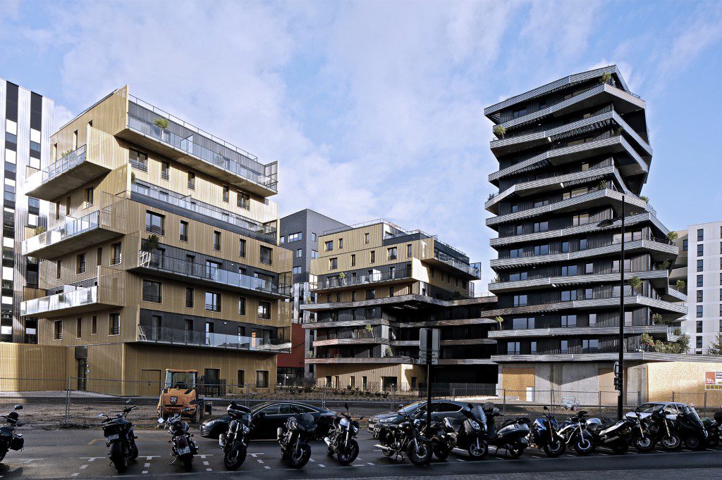
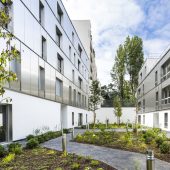
Located in the heart of the new eco-district of Nantes Train Station, the project is the result of the conceptual work of the Agency, he’s taking the measure of a site to support the idea that the density can be a sustainable model for the city.
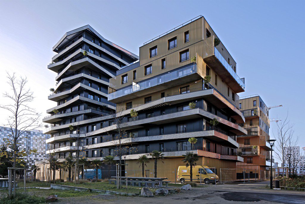
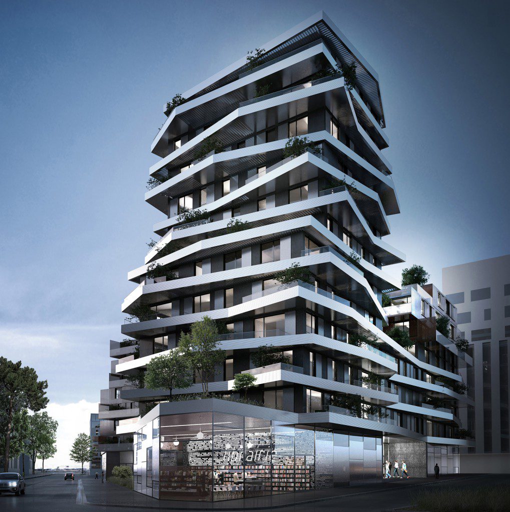
The project is composed by three volumes consistently defined in terms of the environment, sunshine characteristics and urban study of the site. On the block, two distinct and complementary architectures intertwine to create an amazing and generous spatiality.
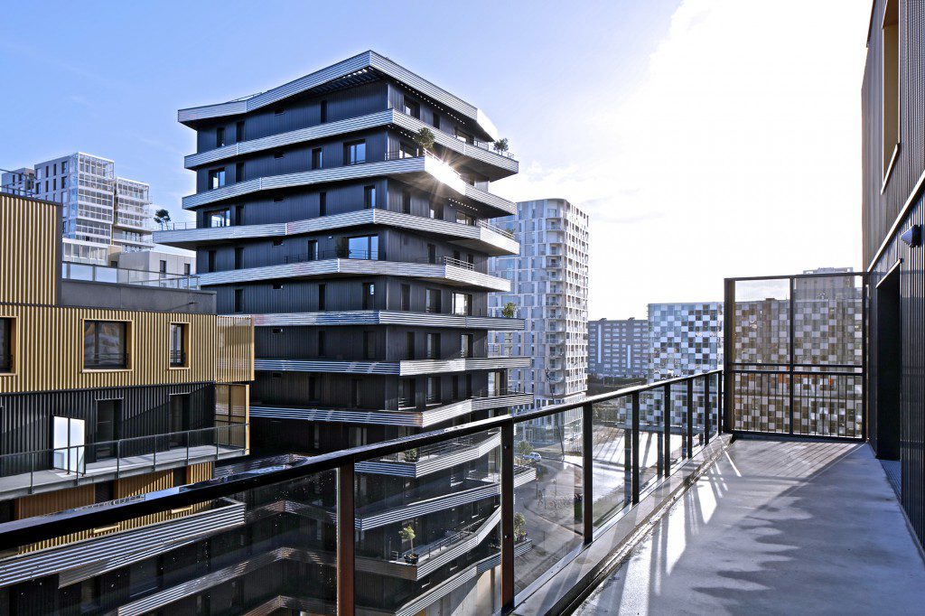
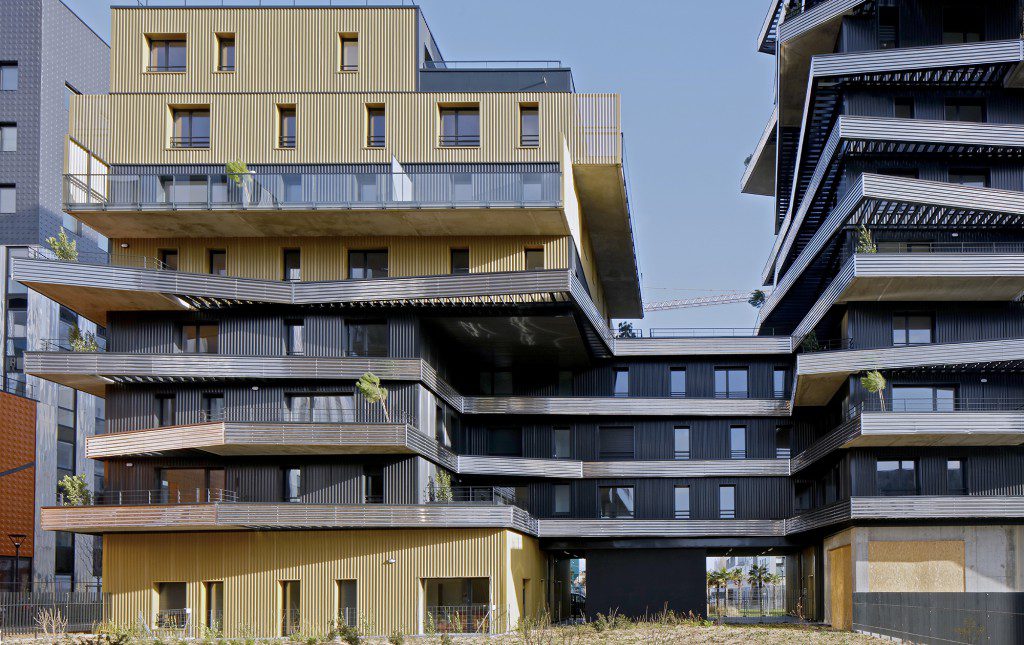
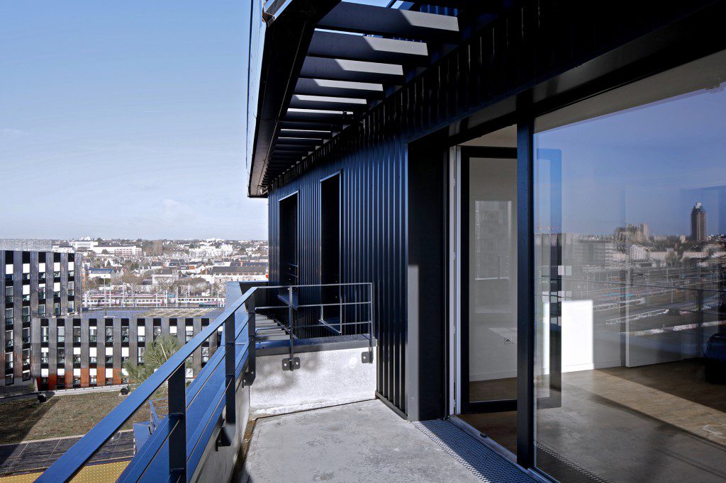
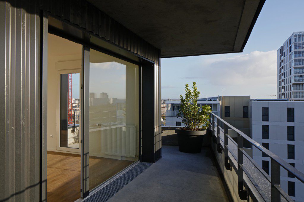
The heart of the block, widely planted, provides a framework around which buildings, who’s open like offset plates from each other. The plant species were chosen for their associations produce sharp contrasts in shapes and foliage textures. Each volume seems like floating on vegetation that surrounds it. Games terraces and balconies steerable give an idea of outdoor spaces in step and offer views of the entire Nantes Métropole.
Building design is very efficient, thanks to the repetition of plans current levels, limiting the stresses and losses and maximizing the balconies of offsets to meet a commitment to quality space while providing more visual lightness to buildings .
The main building together two architectures liberating terraces and an additional brightness opposite the main entrance to the square and the street Nina Simone. The steel bands of the emergence continues in R 3 to Malakoff gym to recover earlier in a second volume writing the isolated building made of kinds cladding perforated boxes posed as a base to reach the same R + 7.
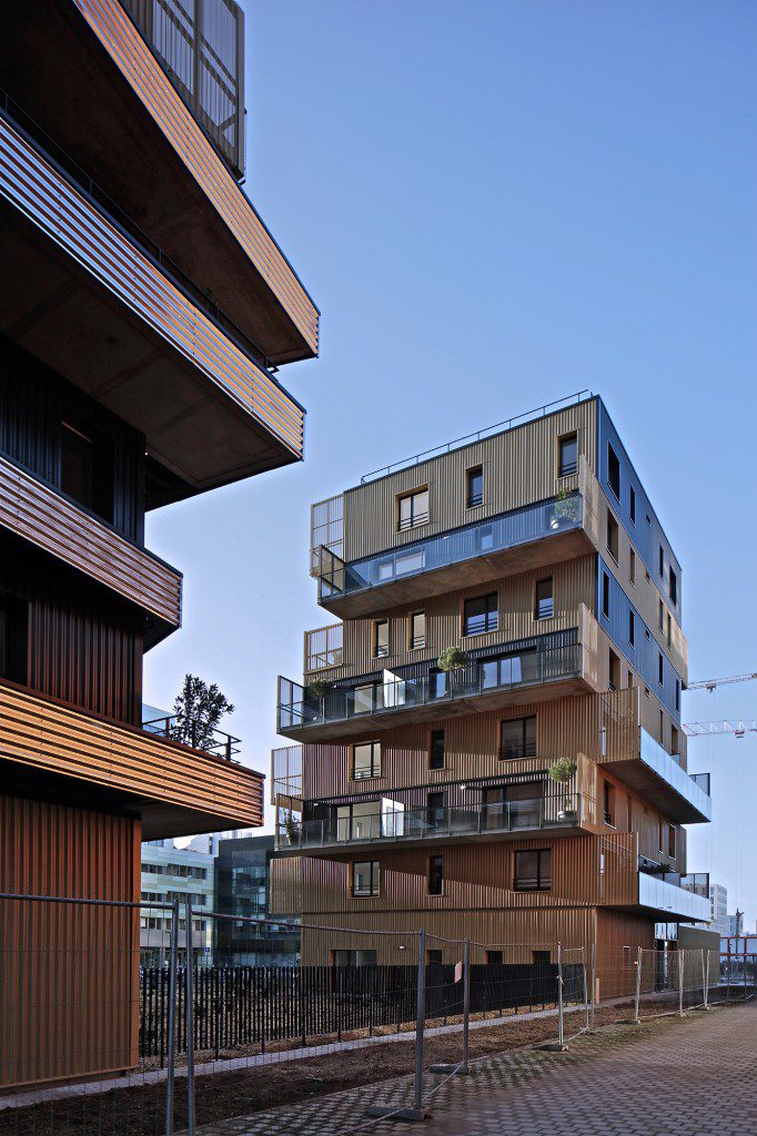
Thus, the isolated building has a strict architecture, the cubic volumes give abstract facades, with gilt flat areas on one side and large linear completely vitreous custody of the other, to create an additional volume punctuating the small island.
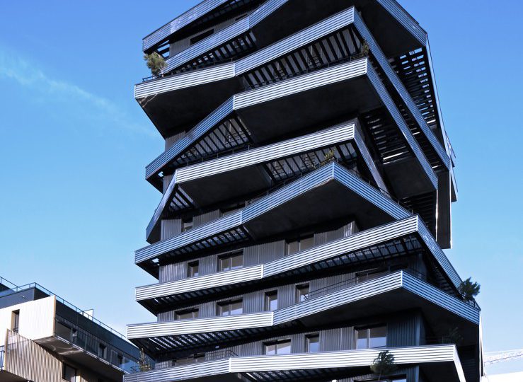
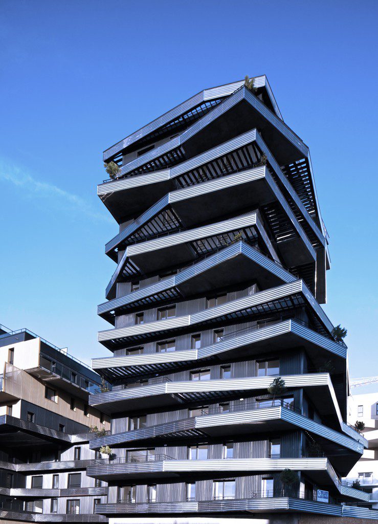
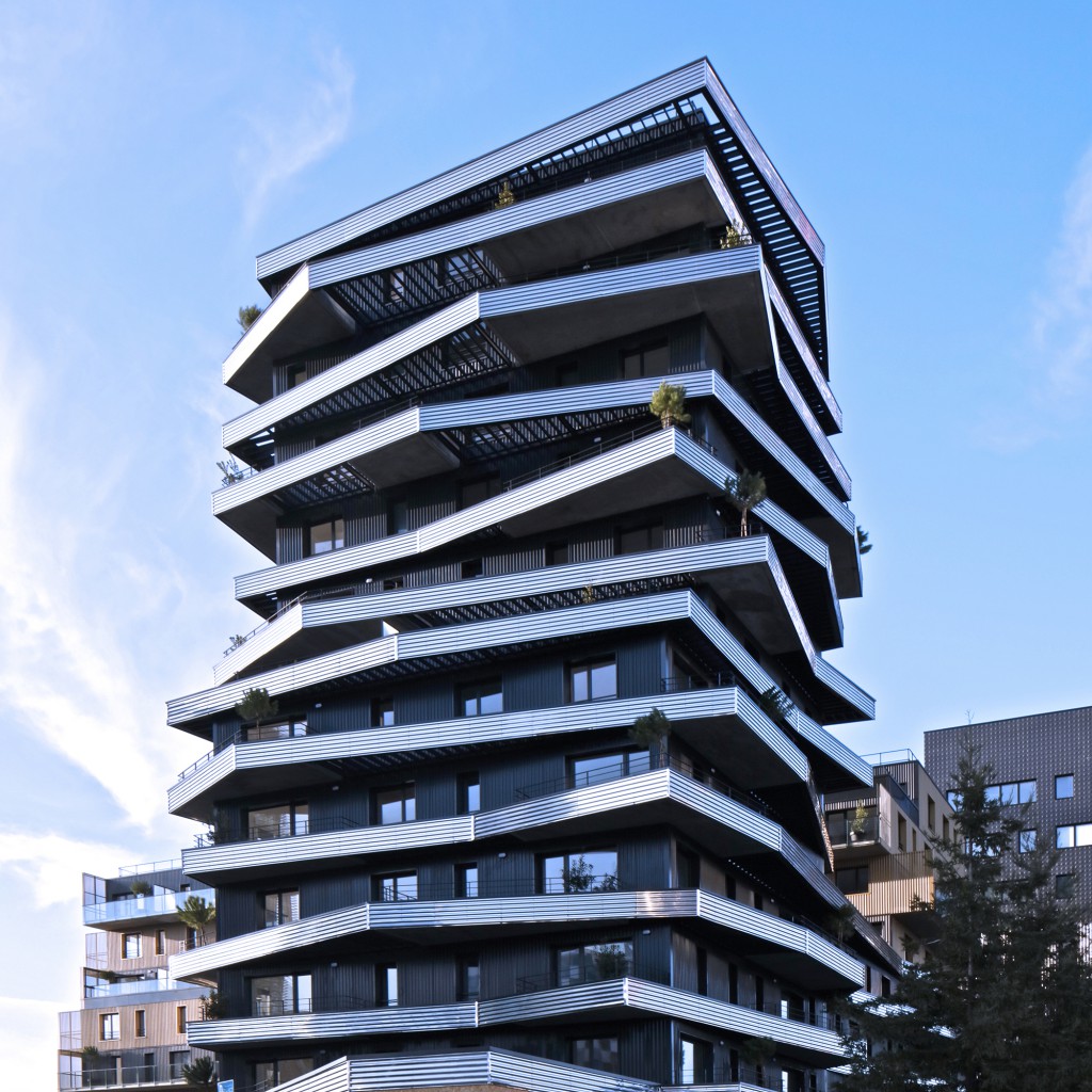
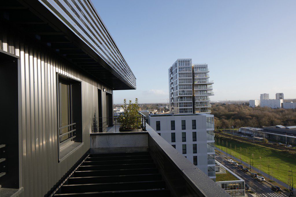
From the distance, the emergence of the main building in R + 11 created by shifts in volumes that provide a single stack, a slim and lightweight silhouette, with varied reflections and shadow and light. Since the crossroads of Pablo Picasso email and boulevard of Berlin, these stories offer a rich volume variations which strengthens the intrinsic quality of each unit, giving the feeling of living on the top floor on all floors.
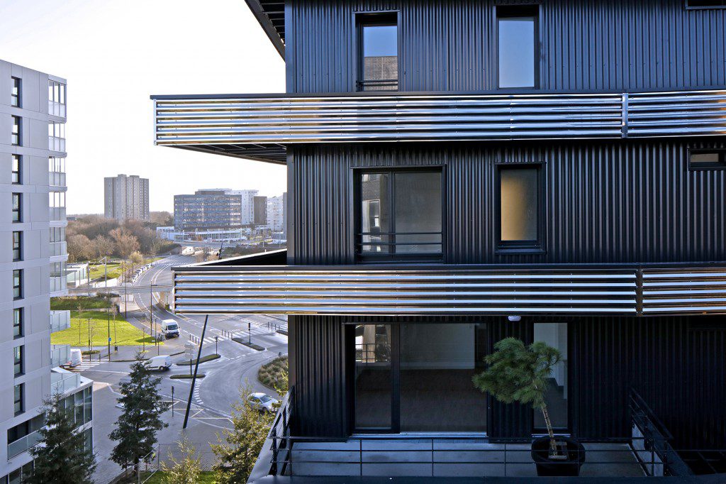
The materiality of the tower, with its nose balconies bright annealed stainless steel, offers a reading shimmering while leaving fade darkest facades in the background, giving a very airy silhouette entire building. The bright annealed stainless steel, serves to emphasize the volumetric changes and broken lines of the project in continuity on all fronts.
The presence of ice-coated steel suns, which surround the building to fit into the organization and balconies create a sense of fragmentation horizontal lines, offers an aesthetic of lightness and massiveness. They claim the laminated floors while providing filtered light shows based on stories by the presence of light rays on the facades of buildings.
Openings pierce the volume randomly in response to balconies and cause various framings, both vertical and horizontal, adding to the comfort inside the housing and which stand out from each other.
The railings of each floor of the main building have a lighter masonry 70cm to guard looks for residents. The project integrates large removable planters that adorn each balcony of a tree planted in pots to encourage a generous image and give a taste of outdoor space set for each user.
At the northwest corner of the positioning of the second building reinforces the urban character of the head of the island on the boulevard of Berlin. This building meets the high-rise neighbor program and creates from the street framing the heart of Malakoff planted island to the gym.
It presents guidelines as varied made possible by the arrangement of angled stays with wide balconies that open sky. A filtering skin is made openwork cladding, while wide balconies open sky, with glass railings that make abstract materiality of the building and go to highlight the overlapping of volumes.
The unity of the island is affirmed by a single treatment of the cladding on the ground floor in total continuity, providing a height of 5m ceiling for businesses. This base material in mono, between gold-copper, welcomes the activities and local bicycle. The main facades on street welcoming activities are a showcase, while the technical rooms in the back are hidden.
The plant heart with landscaping, best manages the relationship with the outside and said transparency in the common hall outside the main building.
This vegetation, very present on the ground and on buildings, consists of species for the most persistent to ensure a green appearance throughout the year, and to participate in the private intimacy of each dwelling. At the scale of the island, this use of a small number of species of trees gives a nice unit, especially in the views from the upper floors.
By AGENCE CHRISTOPHE ROUSSELLE
